Shoonya underpins design across a multi-product merchant experience, and scaling it meant reducing duplication, speeding up workflows, and aligning design with engineering.
My Responsibilities
Research
Auditing
Implementation
Documentation
Collaboration
The BharatPe Merchant App is vast, with many teams building features independently.
Some of the key challenges were:
Designers made many one-off components for small layout or style changes
Local components were scattered, it was difficult to find and reuse older ones
This led to inconsistency across the app and duplicated effort
Lack of system governance made maintaining design quality difficult
Build a scalable design system that fits the app’s growth.
Make components flexible so they can handle variations without forking.
Improve discoverability - make it easy to find existing components.
Enforce consistency across teams.
Speed up the design-to-dev handoff.
I approached this redesign by first understanding how designers and developers actually used Shoonya in their daily work. Every decision was driven by real problems - discoverability, duplication, and lack of flexibility rather than just visual refinement.
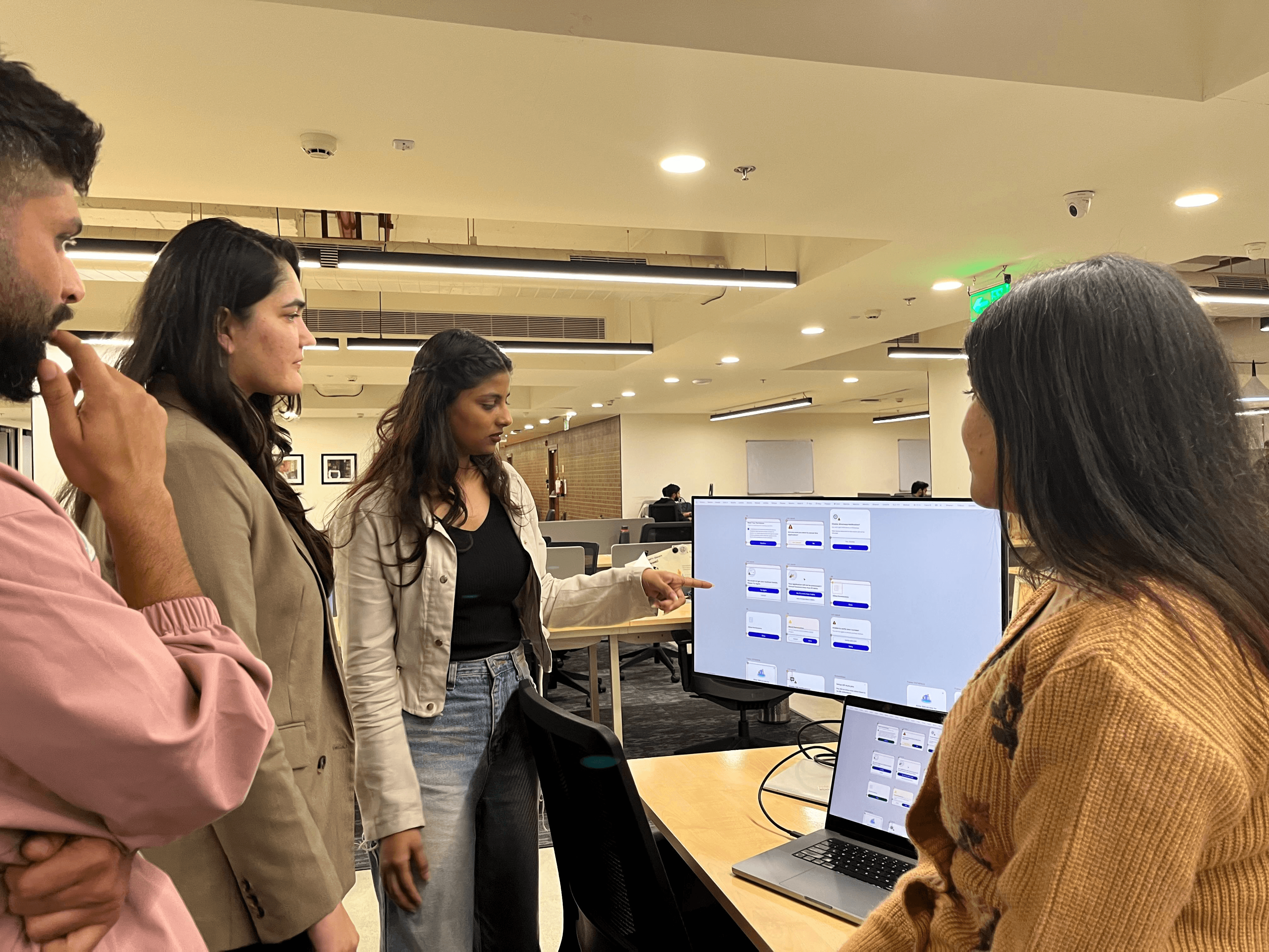
I held interviews and workshops with designers and developers to deeply understand where Shoonya was failing.
Mapped component usage across the product, saw how many duplicates existed, where people were making local variants, and what caused the pain.

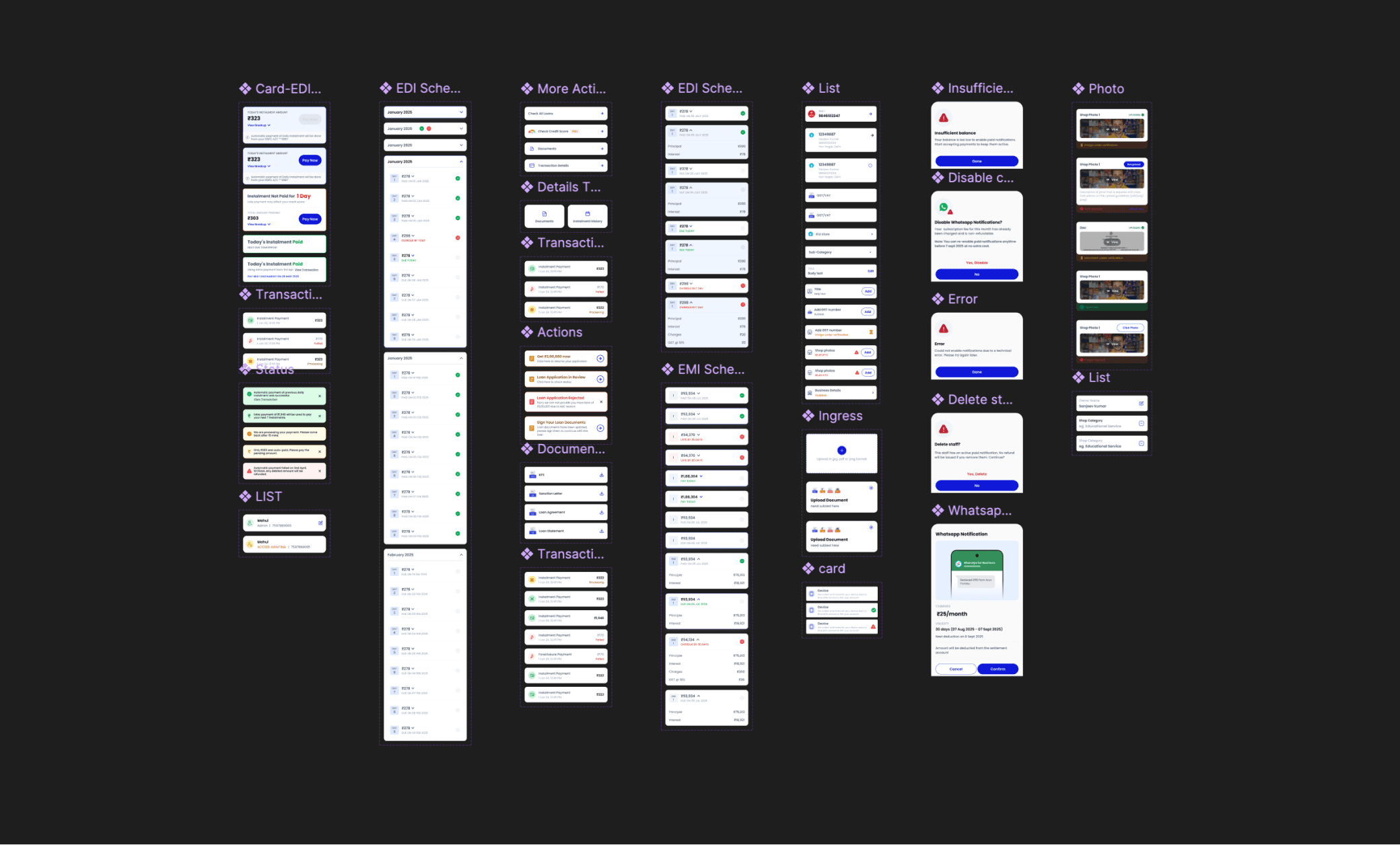
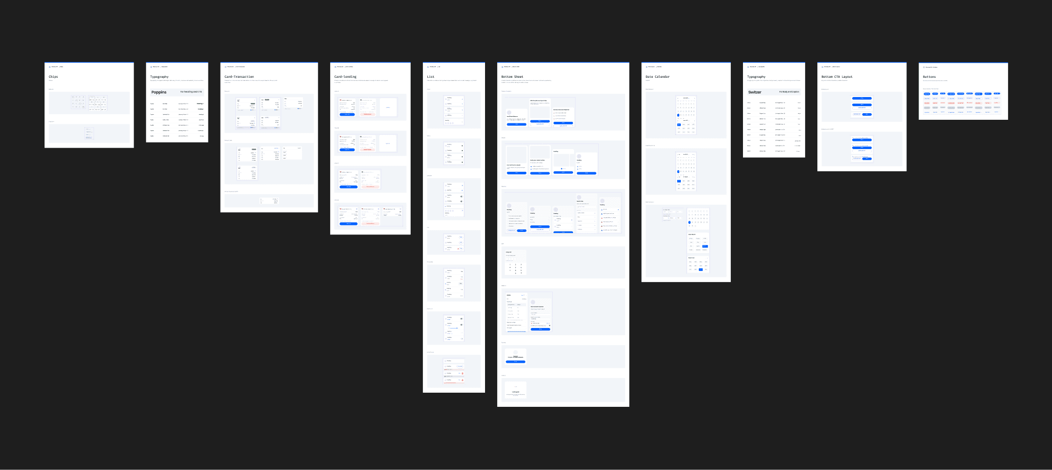
Did a full UI audit: reviewed all screens in the merchant app, listed components, documented variations.
Used this audit to identify redundancies, inconsistent styles, and gaps in the system.
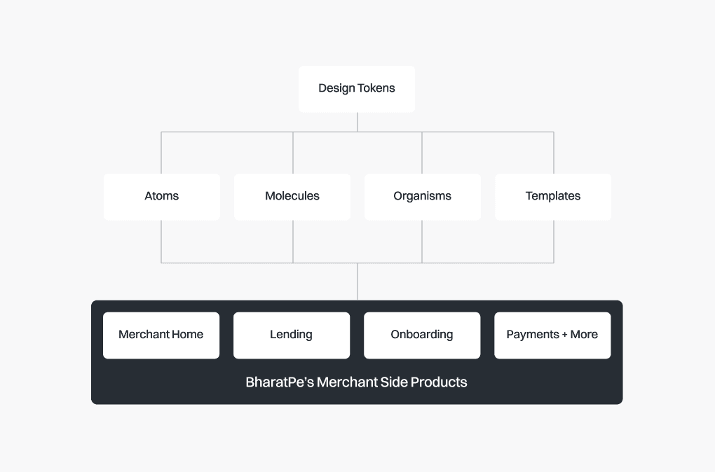
I applied Brad Frost’s Atomic Design to bring clarity: breaking down the system into atoms, molecules, and organisms.
Defined which elements really belonged in each level, so small building blocks (atoms) would not be repeated, and bigger blocks (organisms) became clearly reusable.
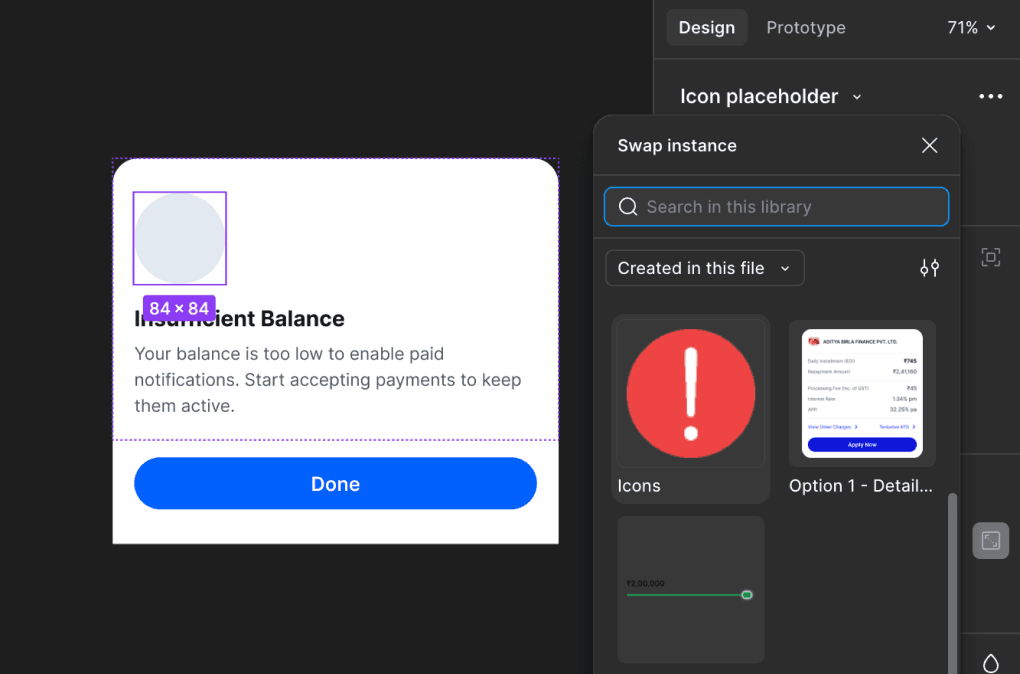
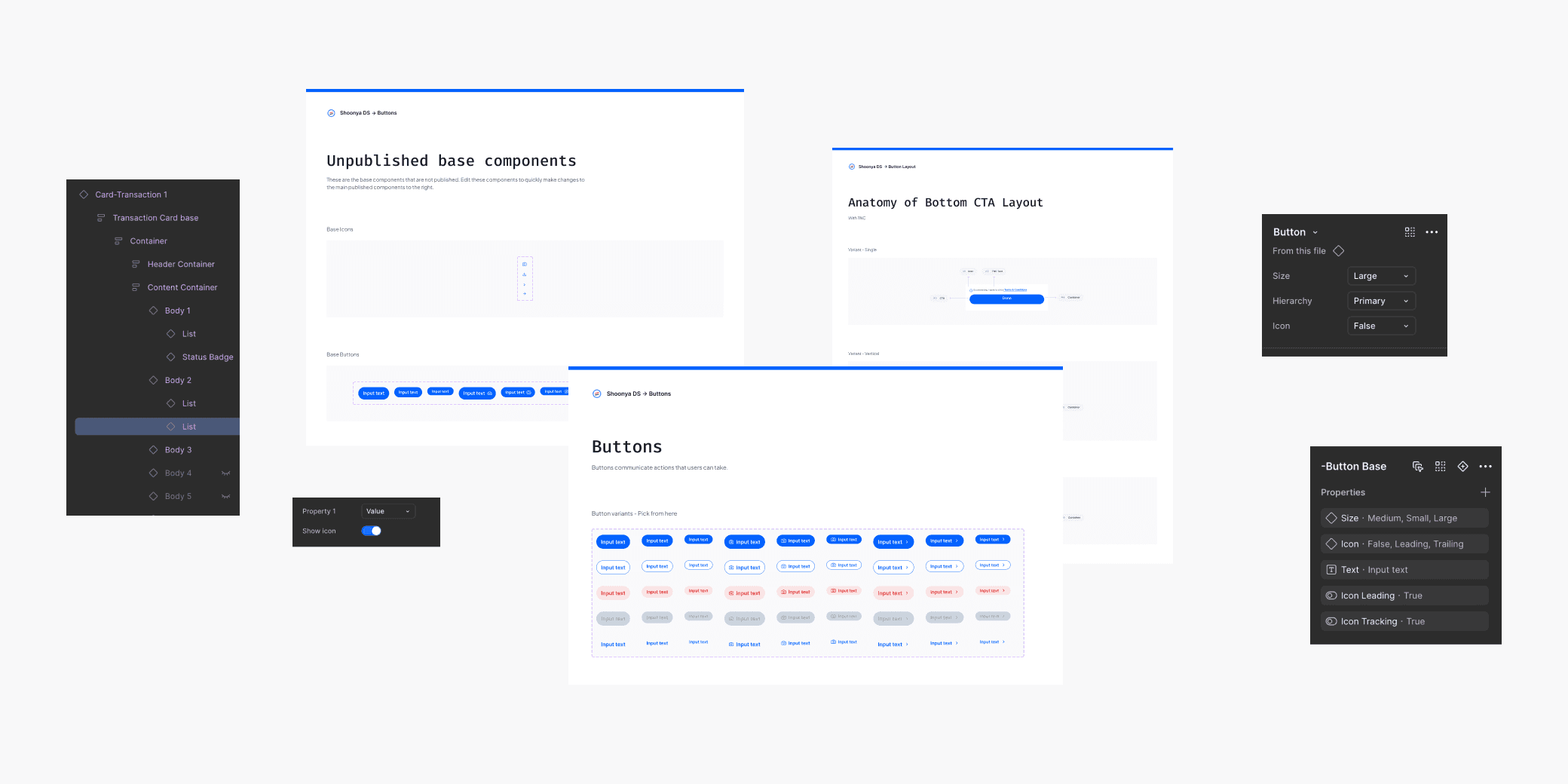
Designed slot-based components: components where parts are left “open” (slots) for content to be plugged in.
This means teams don’t need to create new versions for every variation, they can reuse the same template and plug in what they need.
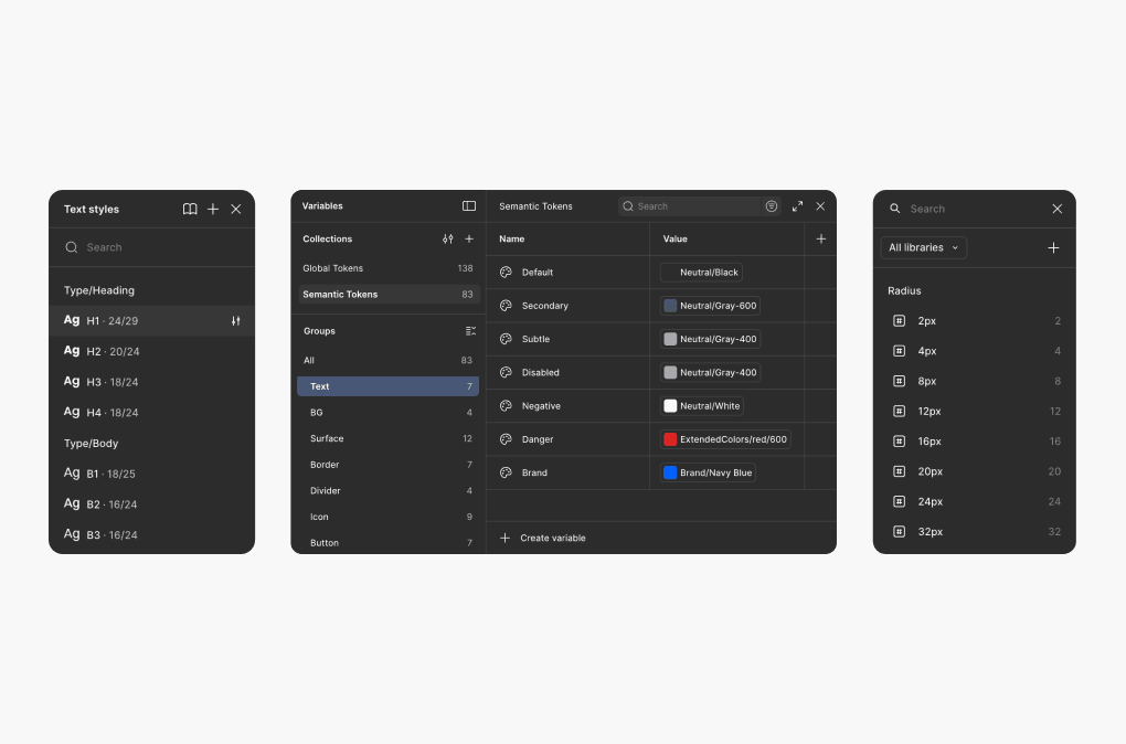
Reorganized the Figma design system file: created clear sections (Tokens / Atoms / Molecules / Organisms) with naming conventions, usage guidelines, and notes.
Documented how to use and extend the system: when to use a component, when not to, and how to propose a new variant if needed.

Collected feedback, iterated on those slot patterns and atomic structure.
Shared prototypes and early component versions with designers and engineers, ensuring the final system would be useful, maintainable, and actually adopted.
The new Shoonya Design System became a flexible, organized, and scalable foundation for the entire BharatPe merchant app.
A unified token system (colors, spacing, typography, radii) that brought visual consistency across screens.
A clean, atomic structure for components - atoms, molecules, and organisms making the system easier to understand and navigate.
Flexible, slot-based components like cards, headers, and buttons that adapt to different needs without creating one-off versions.
A well-organized Figma library with clear naming, documentation, usage rules, and easy discoverability.
Improved alignment between design and development, ensuring components in code matched the design system.
Duplicate components dropped significantly because teams could finally find and reuse existing ones, resulting in 80% adoption and 4x increase in component usage
Designers no longer rebuilt components for small variations, slot-based patterns handled them easily.
The merchant app became visually more consistent, even with multiple teams contributing.
The design-to-development process became smoother and faster, with fewer back-and-forth revisions.
Shoonya evolved from a rigid library into a scalable system that now supports the growing complexity of the app.

Powered by design, curiosity, and chai.